Brittens Restaurant
The Challenge
Brittens is a much loved local restaurant with serious craft behind the scenes, but the brand wasn’t telling that story. It needed an identity that felt rooted in place and reflected the care, personality, and human touch that define the experience.
The Wonderment
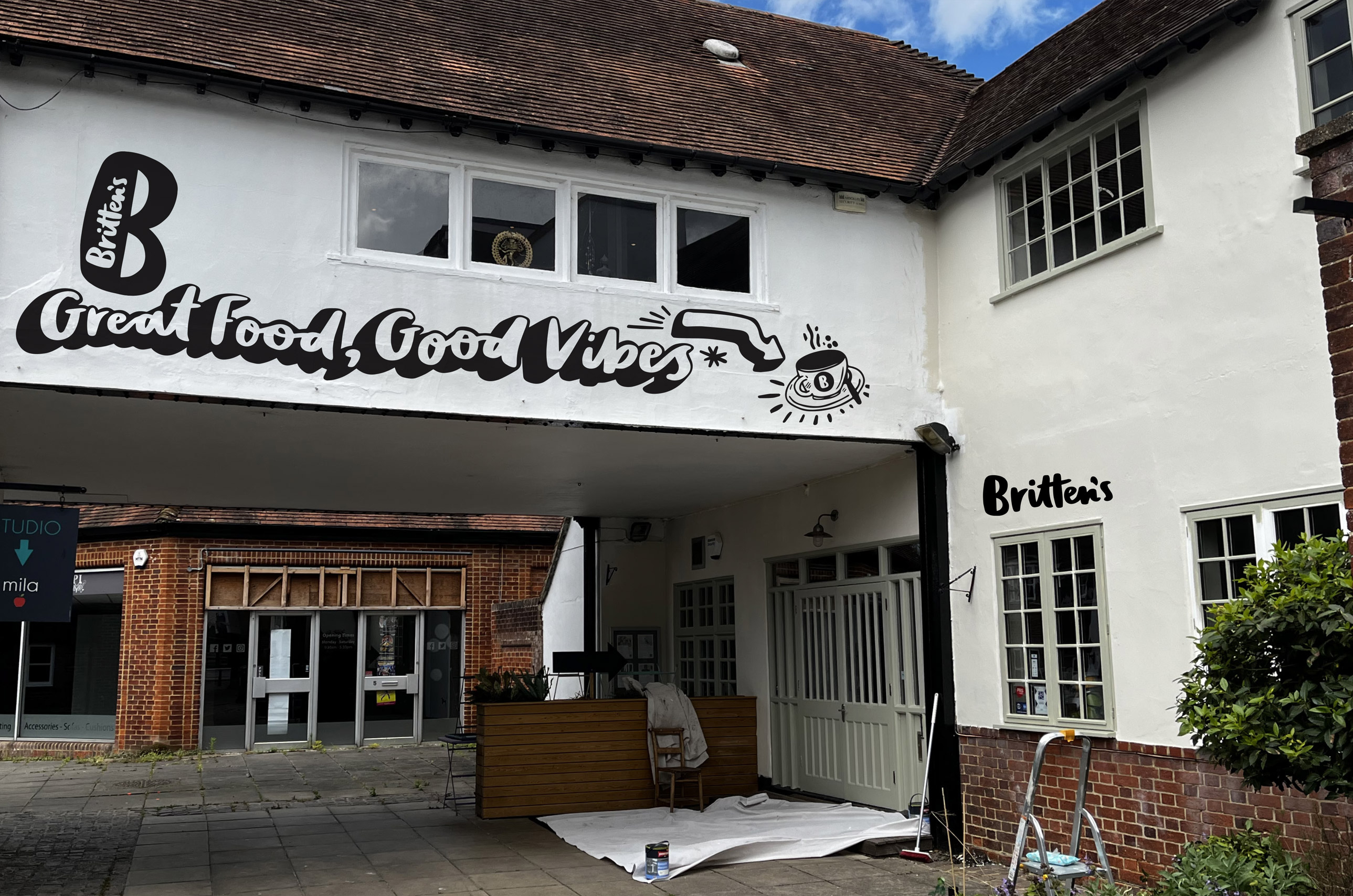
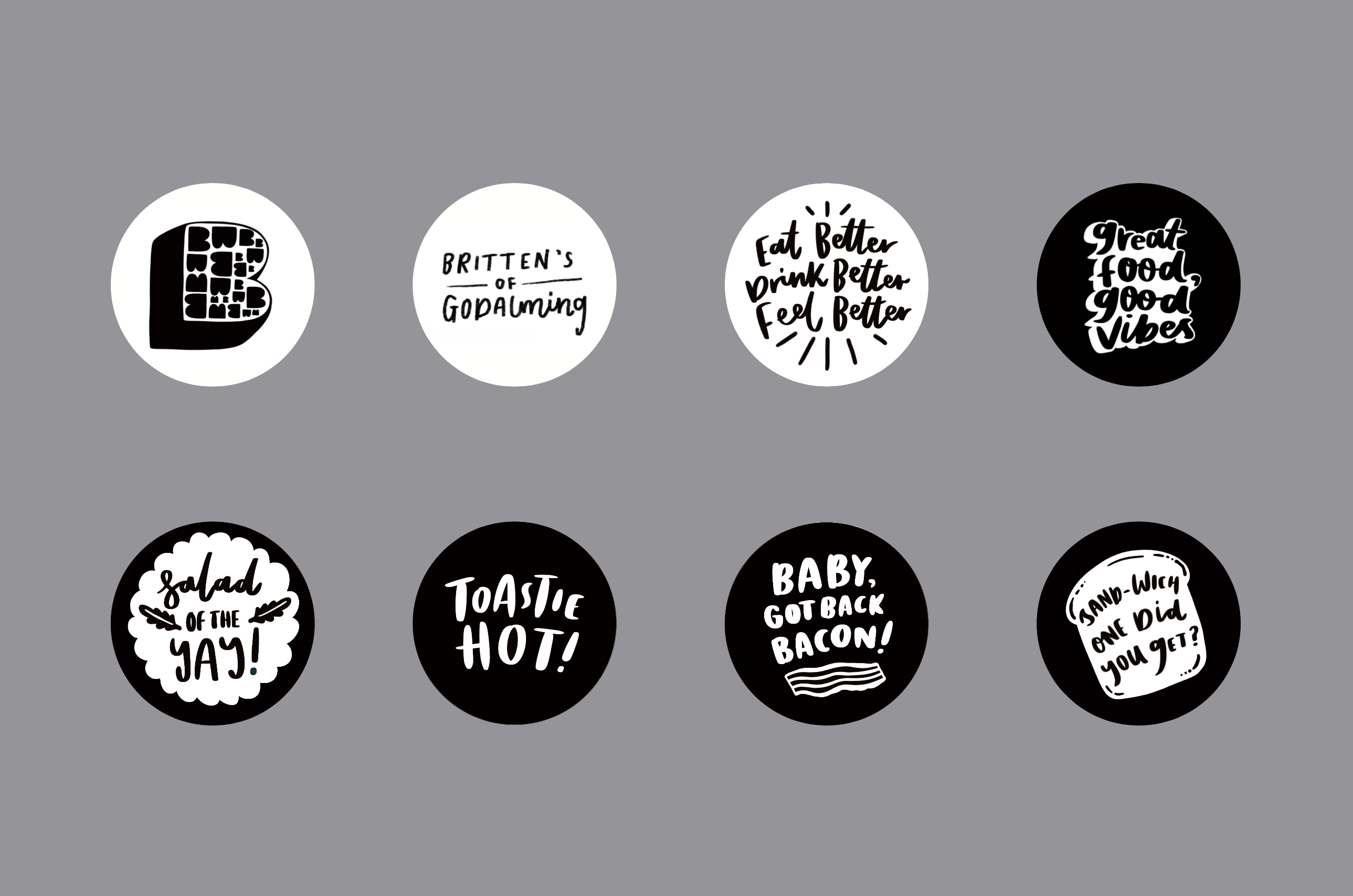
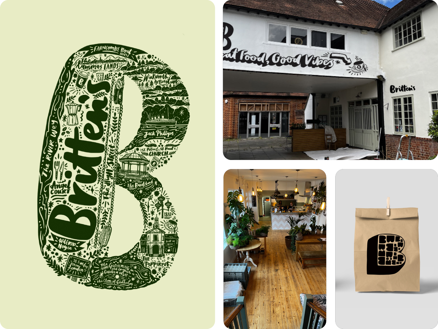
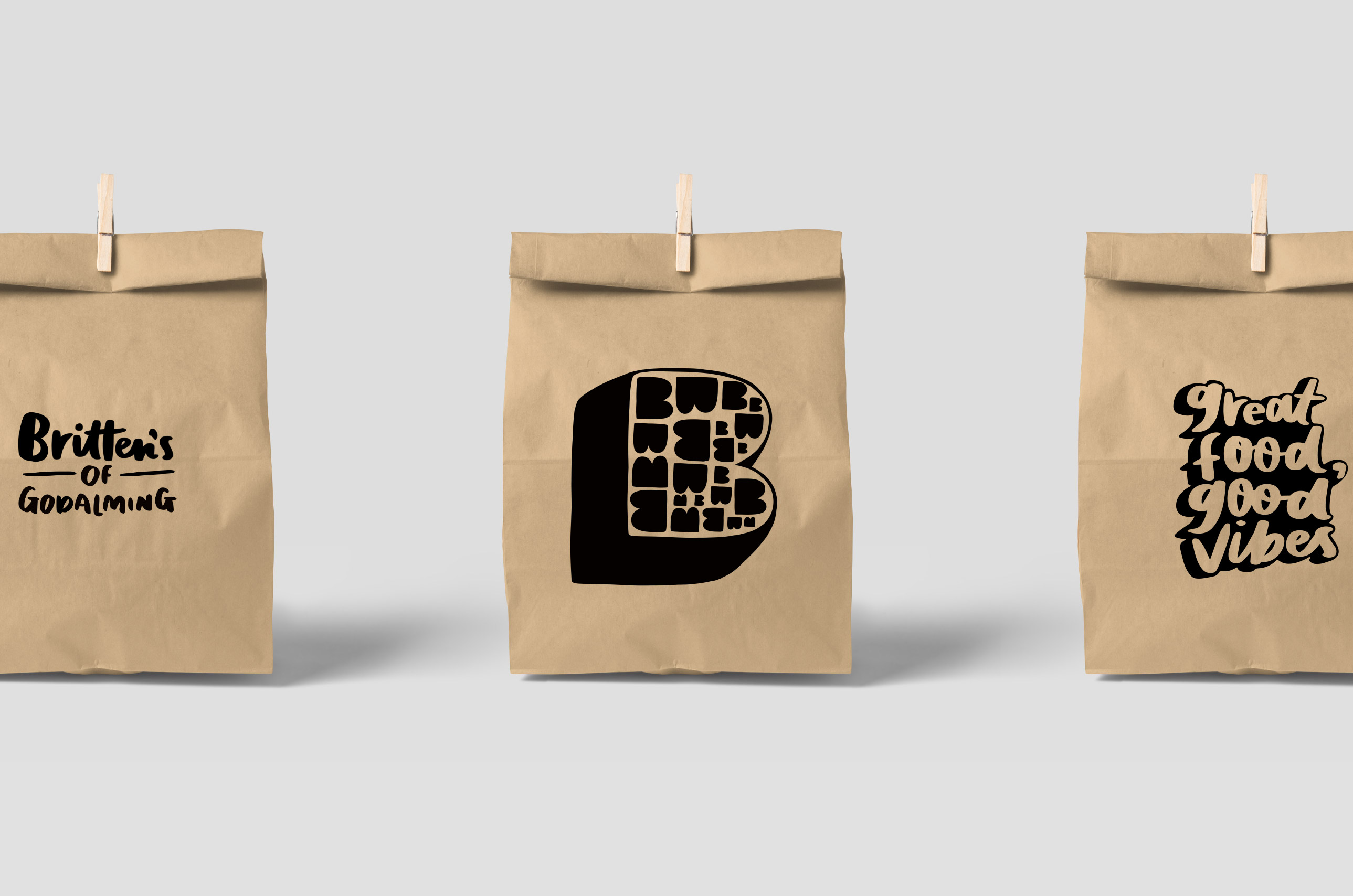
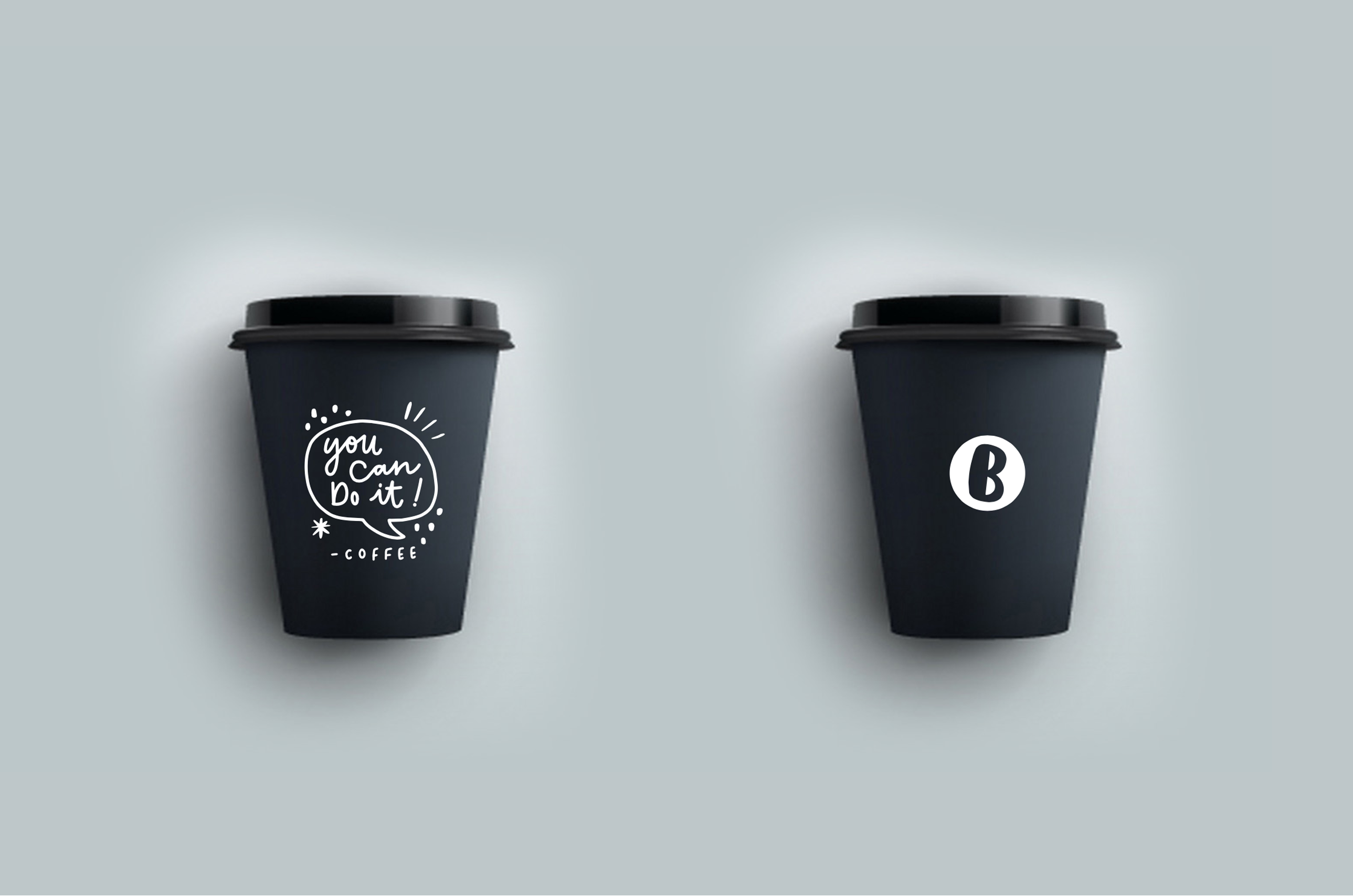
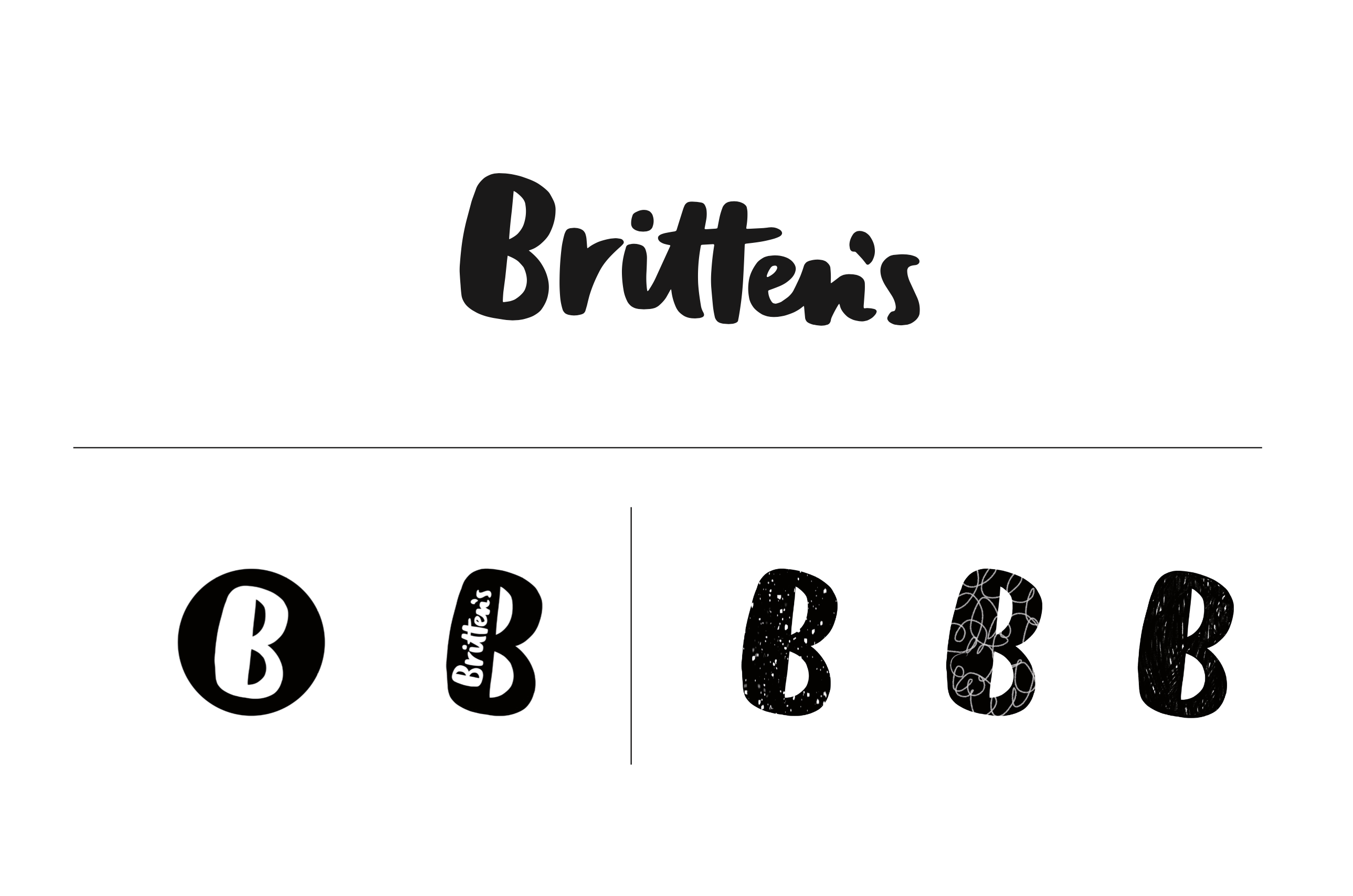
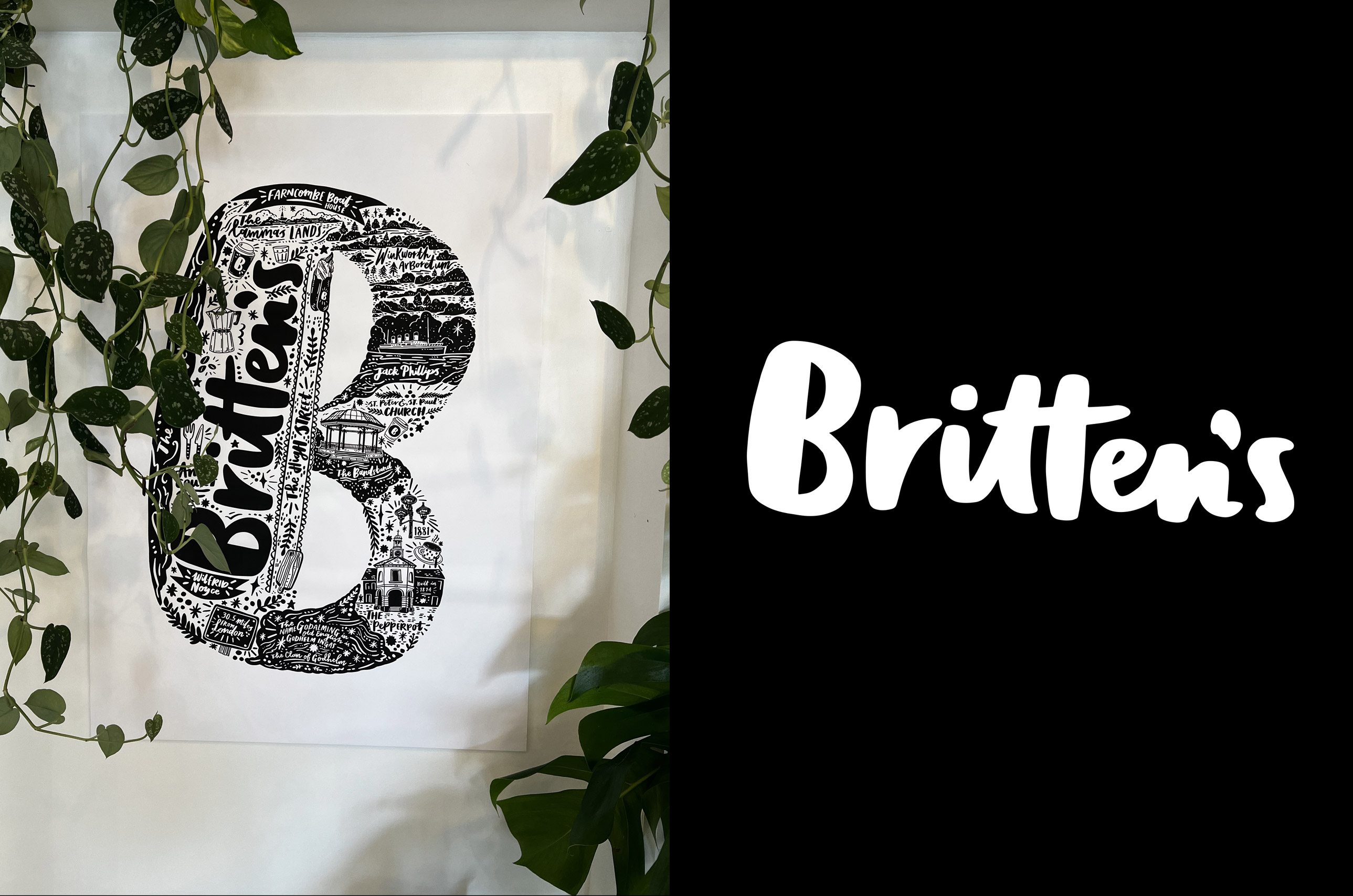
We built the identity around a powerful master letter B, created from the map of Godalming itself, with Brittens sitting at its heart. This was paired with bespoke hand script lettering, designed to match the illustrations and icons, bringing warmth, tactility, and a sense of craft to every touchpoint. Together, these elements created a brand that feels made, not manufactured.
The Result
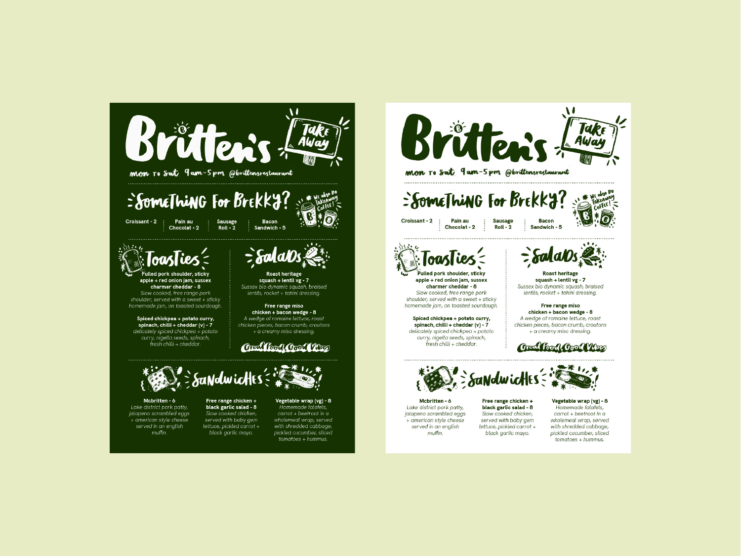
A distinctive, place led identity that feels confident, characterful, and unmistakably Brittens. From menus to signage and digital, the brand now carries a cohesive visual language that celebrates locality, craftsmanship, and the joy of something thoughtfully made.


Subscribe to Wonderfuel
Your fortnightly joy snack dropped into your Moanday morning to remind you that joy isn’t a reward, it’s a survival skill. No hacks. No homework. Just one spark to mess with the gloom.

