
Wonderfuel Issue Number 27 – The joy of missing out and being even better for it


The joy of missing out.
Move over FOMO.
It’s all about the JOMO now.
There’s a quiet kind of joy in missing out. The kind that doesn’t need an audience.
The world seems to be completely consumed by FOMO and what we might be missing out on. What everyone else is doing, saying, buying, wearing, building in AI. Blah blah blah. We’re all completely obsessed with trying to keep up with the world around us.
Doesn’t exactly sound all that joyful, does it?
On the other hand, this sounds a whole lot more joyful.
The joy of not caring who’s messaging you when your phone goes ping.
The joy of wearing what you want and not caring what someone else might think.
The joy of saying no to something everyone else is saying yes to.
The joy of not knowing what everyone is talking about — and being absolutely fine with it.
The joy of watching everyone rush in one direction while you happily wander off in another.
I’ve long had this theory that being self-conscious isn’t really being self-conscious at all. It’s being others-conscious. Worrying too much about what everyone else thinks. Because being truly self-conscious is surely the opposite. Knowing yourself, trusting yourself and focusing on what feels right for you rather than constantly looking over your shoulder at everyone else.
And that, for me, is what JOMO is really about.
JOMO isn’t laziness or opting out because you can’t keep up. It’s opting out because you don’t want to. It’s going against the crowd without making a big thing of it and there’s something wonderfully confident about that. It’s less about not joining in and more about showing up fully where it actually matters to you.
And maybe missing out is exactly what you or your business needs. Because following the crowd is a very good way to disappear into it.
The joy of missing out is a stratejoy, not a sulk.
Less reacting, less comparing and less worrying about what everyone else is doing. More space to work out what you actually think, what you actually want and where you actually want to go.
Because when you stop trying so bloody hard to stand out from the crowd, you might finally give yourself permission to stand alone.
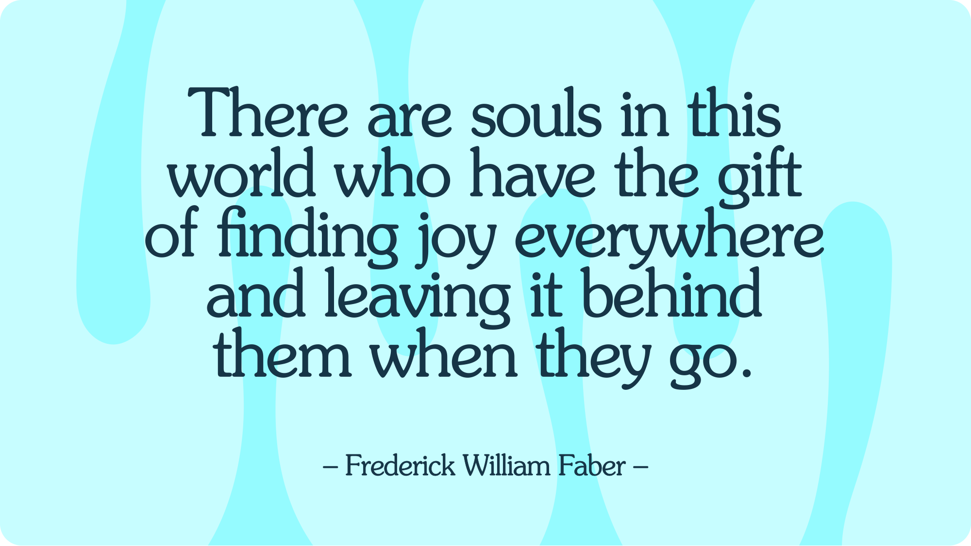
// Quote of the fortnight //
// The founder diary //

That day hurt, a lot and I don’t think I will ever forget it.
I’d lost my mojo. I had massive creative block and was second-guessing everything that I did. So I went and told my boss.
Not quite the supportive arm around the shoulder I was hoping for, he cut my salary, took away my business cards and told me I was lucky to still have a job.
It felt like a monumental kick in the bollocks. My confidence was already on the floor and now my ego had joined it. But looking back, something rather wonderful happened. I stopped worrying about being the creative director I thought I should be and started rediscovering the creative person I’d always been.
I went back to basics, unlearnt some bad habits and remembered why I’d fallen in love with design in the first place. The curiosity, the ideas, the excitement and the sheer joy of creating something wonderful.
I started having fun again and I realised my job title had absolutely bugger all to do with my ability to be creative. That experience changed me and eventually gave me the confidence to stop being who I thought everyone expected me to be and start being myself.
Years later, that same thinking gave me the confidence to create Wonderment. And rather magically, the imposter syndrome that had followed me around for years finally disappeared.
Funny, isn’t it? Sometimes losing your position is exactly what you need to find your place.
What’s the one moment in your career that felt bloody awful at the time but turned out to be one of the best things that ever happened to you?
// The joyful brand – MTV //
MTV didn’t just change the way we watched music.
They changed the way we thought about brands.
When MTV launched in 1981, most businesses treated their logos like precious little works of art. Everything set in stone, heaven forbid anyone should dare mess with the brand guidelines.
Then MTV came along and broke all the rules.
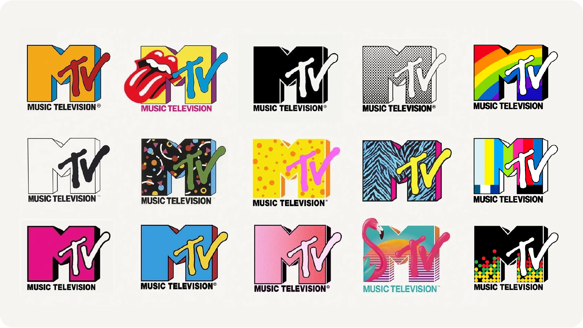
Created by Manhattan Design, the now-iconic MTV logo was one of the earliest examples of a dynamic brand identity. The chunky M and scribbled TV stayed the same but everything else was up for grabs.
Colours changed. Patterns appeared. The logo was animated, stretched, filled with weird and wonderful imagery and generally messed about with in ways that would have given most brand managers a nervous breakdown.
And that was the genius of it, rather than trying to make the brand look exactly the same everywhere, MTV made it feel the same everywhere. Rebellious, energetic, unpredictable and gloriously creative.
Every time you saw the logo, you knew it was MTV. You just never knew what it was going to do next and I absolutely love that.
Because the best brands aren’t necessarily the ones that follow the rules most consistently. They’re the ones that create a feeling people consistently recognise. MTV proved that consistency of feeling can be far more powerful than consistency of appearance.
And more than forty years later, I think there’s still a lot we can learn from that.
That’s the joy of MTV.
// From the archives – Understanding Jewellery //
There’s something rather lovely about creating a modern identity for a business built around something as traditional as jewellery.
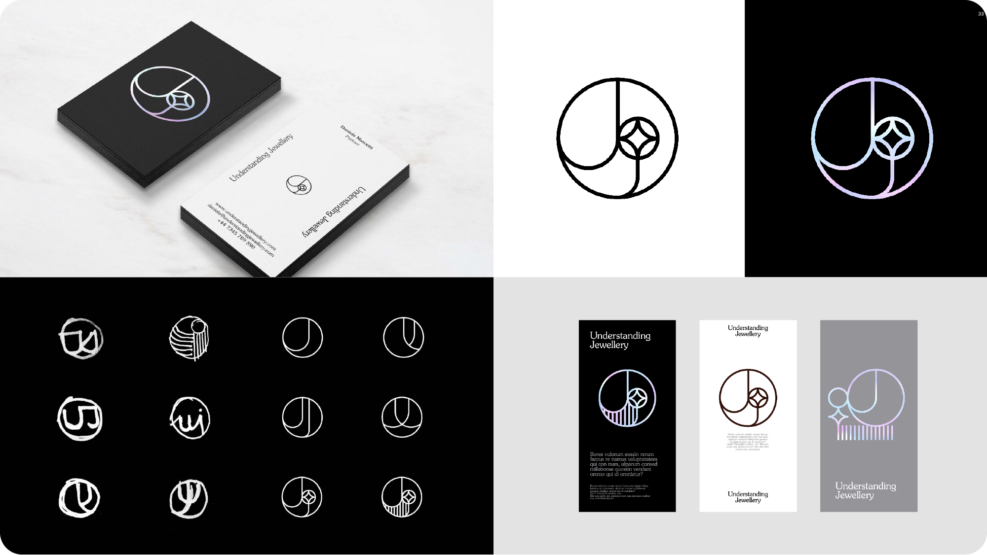
For Understanding Jewellery, I wanted to create a mark that felt contemporary and elegant, but also had a little nod to the craftsmanship and heritage of the industry.
The inspiration came from traditional jewellery hallmarks. Those tiny, beautifully crafted symbols stamped into precious metals to tell you something about their origins and authenticity.
So out came the sketchbook.
Lots of scribbling, experimenting and exploring how the U and J could come together to create a distinctive little hallmark of their own. Eventually, the two letters became one continuous, circular symbol, with a subtle diamond detail nestled inside.
Something simple, considered and hopefully rather timeless.
And that’s one of the things I still love most about designing identities. The joy of taking an idea from a rough little pencil sketch and turning it into something that feels like it was always meant to exist.
A little mark. With a lot of thought behind it.
Want to see some more work? Here you go…
// Word of the fortnight – Superhumanise™ //

For years, businesses have been banging on about being more human. More approachable, more authentic, more relatable and a little less corporate. And quite rightly too. Nobody wants to do business with a faceless, soulless organisation.
But here’s the thing. Being human isn’t really a competitive advantage anymore. It’s what people expect. And if your business is still trying to be more human, you’ve probably got some catching up to do.
So perhaps the opportunity isn’t simply to be more human than everyone else. It’s to make people feel more human than everyone else.
I call it Superhumanising™.
And no, before you start imagining your accountant wearing a cape, I’m not talking about superpowers.
I’m talking about intentionally making people feel extraordinary. Making them feel seen, appreciated, confident, inspired, excited or even a little bit special.
Imagine an accountant who doesn’t just sort out your finances but makes you feel brilliantly in control of your future. Or a recruitment agency that doesn’t just find you a job but makes you feel like someone has finally recognised your potential.
Same services. Completely different feelings.
Because being more human is lovely, but it’s how you make other humans feel that creates the real magic.
Being human is ordinary. Making people feel extraordinary isn’t.
And that, my friends, is Superhumanising™.
Click to see all my other made up words
// Ridding the world of boring PDF guidelines //
RIP Brand Guideline pdf
You were beautiful, but nobody opened you, ever.
We designers spend months, sometimes years building beautiful brands. And, then hand them over in the world’s most forgettable format.
A PDF.
All that brand love and creativity only for the guidelines to disappear into someone’s downloads folder, never to be seen again. Surely brands deserve better than that?
Well, my buddy Tom and I thought so too.
So, meet Brandito.
Slowly ridding the world of pdf guidelines one by one.
An altogether happier home for your branding. All your logos, colours, fonts and assets in one place. Always up to date. Always looking lovely. And soon (when Tom gets back from his hols) on-brand social graphics without the Canva chaos.
We built this for our own clients and we’ve had a few lovely designers and studios to come play and test it out and now we are ready to share it with the world
If you have an existing brand guideline pdf that is sitting somewhere in a folder on a shared drive that no-one ever opens, drop me a line and I can show you brandito can change it into a wonderful online home for your brand.
Yes please! Show me how this works
// The Wonderfuel archive //

So you missed an episode of Wonderful. Don’t worry joy never bears a grudge. Here is a link in that will allow you read all the past issues in the joynal on the Wonderment Website.
Popcorn at the ready…
Off you go!
Click for the Wonderfuel Archive


Subscribe to Wonderfuel
Your fortnightly spark of Strategic Joy™, landing in your inbox every Moanday morning. Because joy isn't a reward for getting through the week it's what gets you through it. No hacks. No homework. Just one idea engineered to mess with the gloom.
