Wonderfuel Issue Number 20 – The joy of neatly arranaged objects
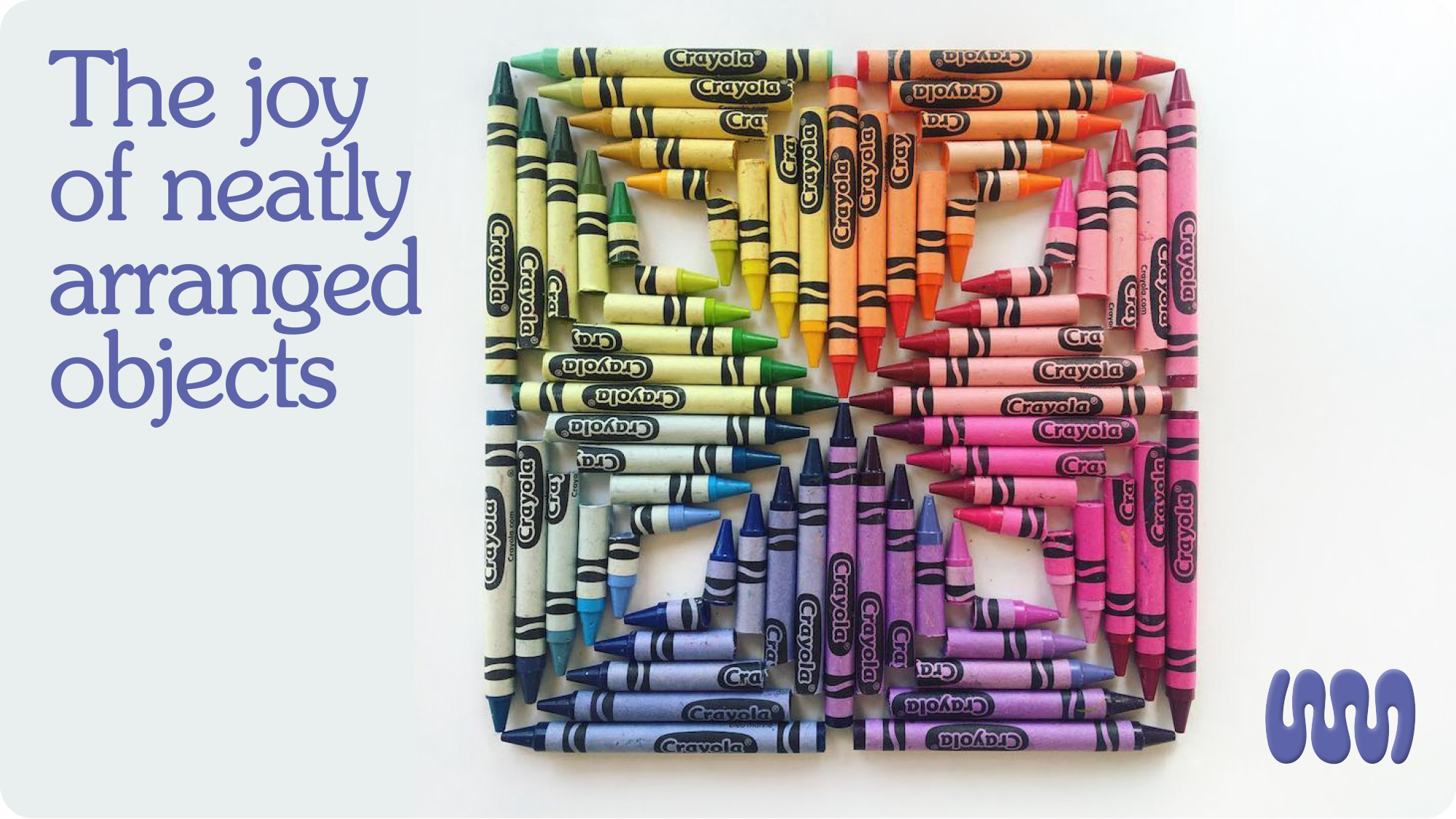
There’s a particular pleasure in a well-organised drawer. A shelf where everything has a place. A desk cleared at the end of the day, objects lined up just so.
You probably know the feeling, that small, quiet hit of satisfaction when things are neat, ordered, symmetrical.
It turns out that’s not just you being a bit odd. It’s biology.
Ingrid Fetell Lee, in her brilliant book Joyful, identifies harmony as one of the core aesthetics of joy, the idea that order, symmetry, repetition and neatness trigger a genuine emotional response in the human brain.
We are wired to find pleasure in things that are arranged well. It’s not a personality quirk. It’s a design principle. And once you see it, you can’t unsee it. The dopamine hit of a perfectly stacked bookshelf. The odd satisfaction of colour-coded stationery. The reason flat lays work so well on Instagram, why advent calendar reveals feel disproportionately exciting, why a well-set table makes a meal feel like an occasion before a single dish arrives.
Order signals safety. It signals intention. It says that someone thought about this. Someone cared.
Which raises an interesting question for anyone working in brand or design. If neatly arranged objects create joy, not metaphorically, but neurologically, then the way you present things matters far beyond aesthetics. The layout of a page. The spacing of a logo. The rhythm of a product range on a shelf. These aren’t just design decisions. They’re emotional ones.
Joy, it turns out, is in the details. Quite literally.
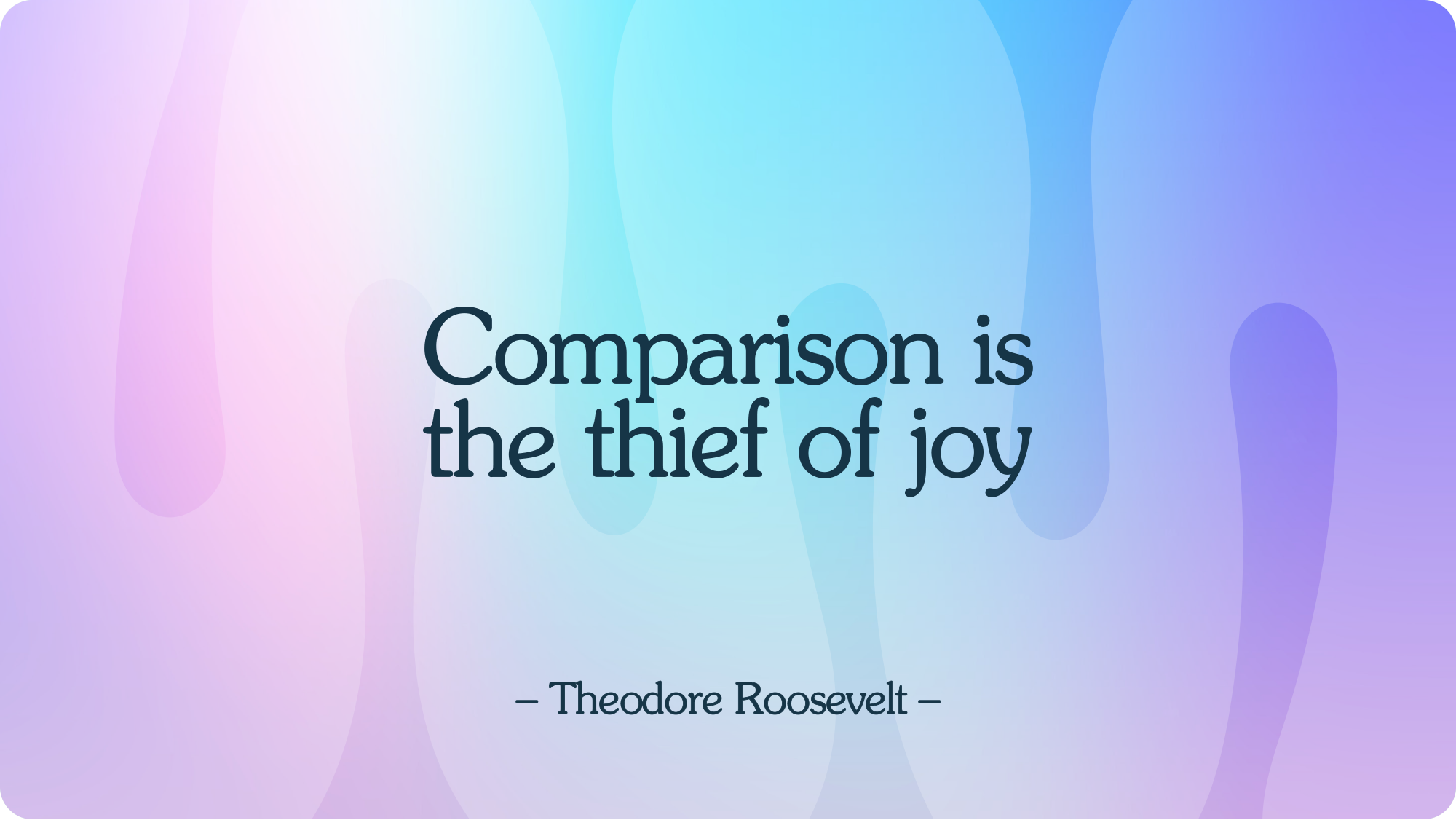
// Quote of the week //
// The founder diary //
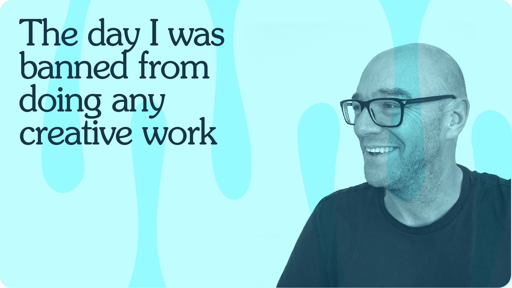
It’s circa 1999 and I’ve just landed my second ever job at design agency The Field in Richmond-upon-Thames, Surrey.
I’m only a week in, sat working on a design layout with my new creative director peering over my shoulder.
He’s watching closely. Then suddenly he shouts something in Polish, the tone alone tells me everything I need to know. He is not happy.
Despite having charmed my way through the interview on personality, charisma, creativity, my Mac skills are letting me down badly.
“Every time you go to the menu at the top of the screen to select a dropdown, it is costing the agency time. You are too slow. Do you not know any of the keyboard shortcuts?”
“Er… no,” I reply, quietly convinced my brilliant new job is about to be pulled out from under me.
“Right. Then I am banning you from doing any design work for this studio until you know every shortcut in Illustrator, QuarkXPress, Photoshop.”
Almost 28 years on, not a week goes by where I don’t think about what seemed, at the time, like the most ridiculous move a creative director could make.
But he had a point. One that has served me well across a now 30-year career: don’t let your ability be limited by the tools you’re using.
Because tools change. Software gets updated, replaced, discontinued, and if your ability is tethered to a specific one, you’re not as capable as you think you are. You’re just well-equipped. Mastery isn’t about knowing the tool inside out. It’s about knowing your craft well enough that no tool can hold you back.
// The joyful brand – Mailchimp //
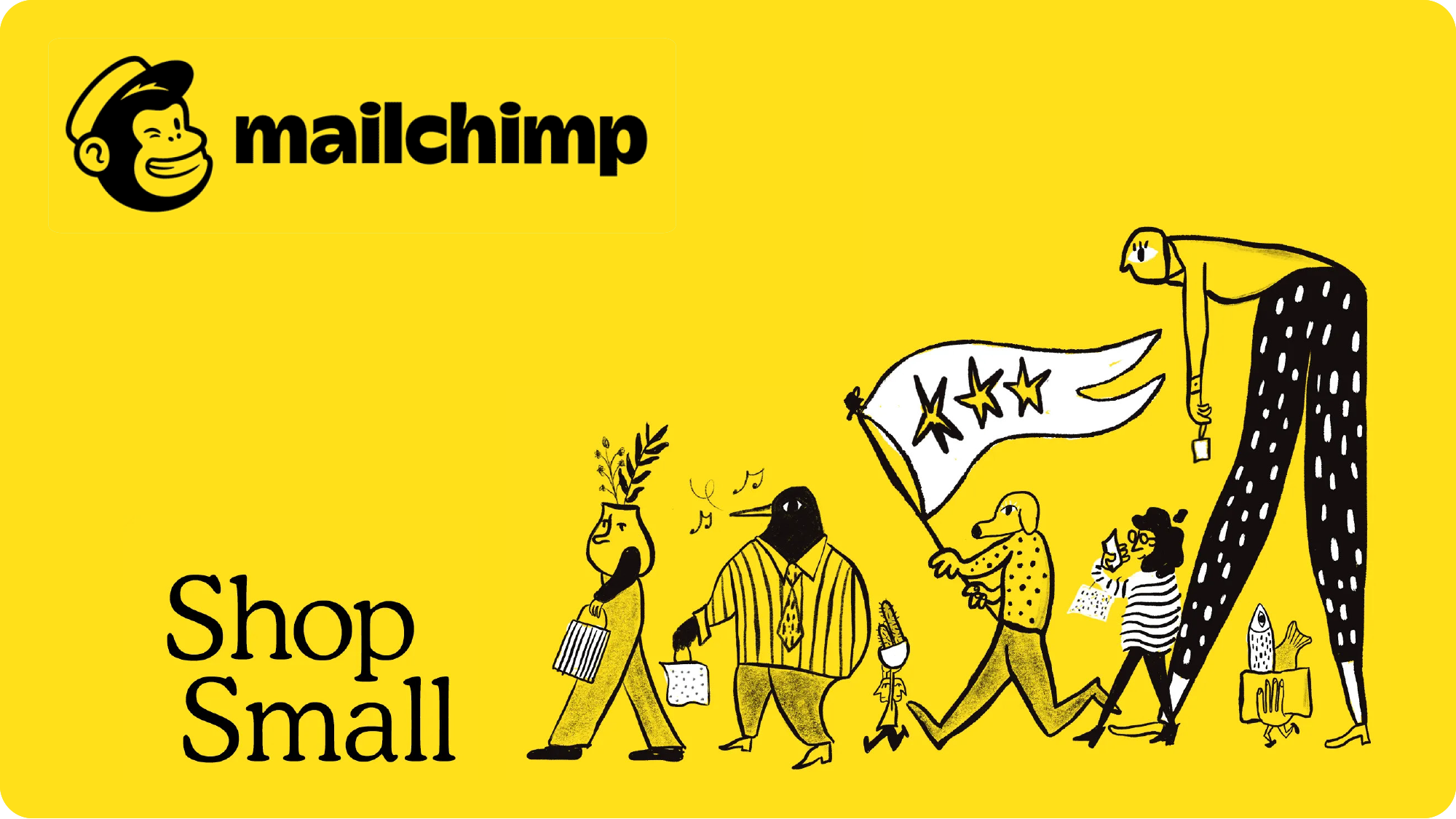
Email marketing is, on paper, one of the least joyful corners of the business world. Open rates, unsubscribes, compliance, deliverability. It’s the kind of category that practically begs to be boring.
Mailchimp decided not to be.
From the beginning, Mailchimp built a brand that felt like it had been made by humans, for humans. The tone was warm, funny, occasionally a little weird and completely at odds with every other platform in the space. Where competitors leaned into dashboards and data, Mailchimp leaned into personality.
A lot of that personality lived in Freddie. The chimp mascot who high-fived you before you sent a campaign. Who got nervous on your behalf. Who celebrated with you when the numbers came in. In a product built around the anxiety of hitting send to thousands of people, Freddie was a small, silly, genuinely brilliant piece of emotional design. He made the scary bit feel less scary.
The illustration style did the same job at scale. Loose, characterful, full of energy. It said “we don’t take ourselves too seriously and neither should you”. That’s a radical position in B2B software, where the default is to project authority, precision, seriousness. Mailchimp projected delight instead.
And it worked. Not despite the joy, because of it.
// From the archives – Dave Hicks Putting //
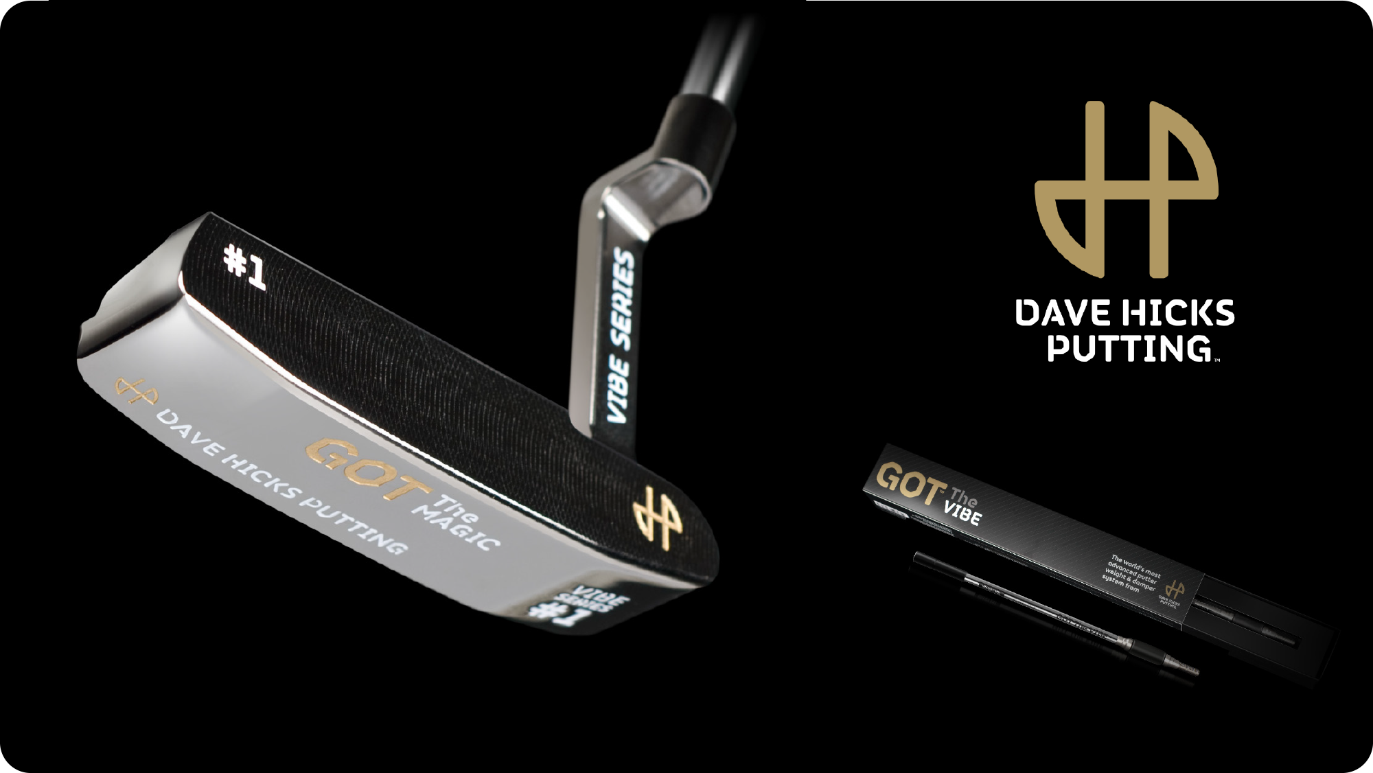
Alongside my passion for all things creative was a burning desire to become a professional golfer. By 19, I’d given up on that dream, my putting was, to put it diplomatically, a bit shit.
So who would have thought that ten years later I’d find myself as an investor in a golf technology business focused entirely on putting.
My investment came in the shape of the brand I created for it. The logo was always going to be round, for obvious reasons.
The black and gold palette, with its subtle pinstripe and grotesquely bold chiselled stencil, was designed to sit somewhere between the cucumber sandwich stuffiness of the golf club and the high street mass market boom the sport was riding at the time. It transcended both.
The copy lines didn’t hurt either. “We’ll make you a better putter, by making you a better putter.” A line that worked on two levels and made me quietly very pleased with myself. A stroke of genius... (sorry)
We tried to sell the business and the technology to one of the big players. It didn’t happen. The idea slowly fizzled out, as ideas sometimes do, but this remains one of my personal portfolio favourites. Partly because the work was good. Mostly because I got to design putters, which for a failed teenage golfer is about as close to closure as it gets.
I still have some of them.
// Word of the week – Humotional™ //
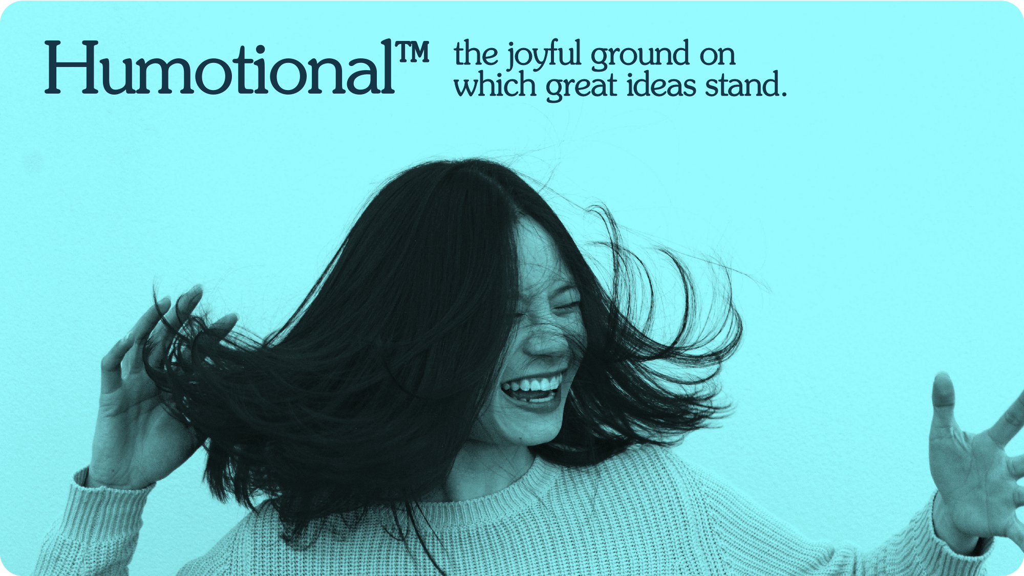
The state of being both fully human and fully felt at the same time. Not warm for the sake of warmth. Not emotional for the sake of impact. But the particular quality of a brand, a moment, or a message that lands in the body before it registers in the mind, because it was made by someone who remembered there was a person on the other end.
Humotional is what happens when humanity and emotion stop being two separate considerations and become one instinct. It is the difference between a brand that understands its audience and a brand that feels its audience. Between a touchpoint that is well-designed and one that is genuinely felt.
Most brands are informational. Some are emotional. Very few are humotional, where the feeling comes not from craft or strategy alone, but from the unmistakable sense that another human made this, for another human, on purpose.
It is the affective advantage made visible. The human algorithm at work. The moment where return on feeling stops being a metric and starts being an experience.
You can’t fake humotional. You can only build it , by designing for feeling first, and letting everything else follow.
// Who or what is Wonderment //
"OMG. I love that brand."
Six words. One feeling. Zero logic. That's the moment every brand is chasing and most never reach. Not because they're not good enough. Because they're not felt enough. That feeling doesn't happen by accident. It's enjoyneered. At Wonderment, I turn fundamental businesses into wondermental brands. Joyful. Felt. Remembered. Impossible to ignore. Got a branding itch that you want to scratch? Please drop me a line.


Subscribe to Wonderfuel
Your fortnightly spark of Strategic Joy™, landing in your inbox every Moanday morning. Because joy isn't a reward for getting through the week it's what gets you through it. No hacks. No homework. Just one idea engineered to mess with the gloom.