Wonderfuel Issue Number 15 – The joy of a being a kid again

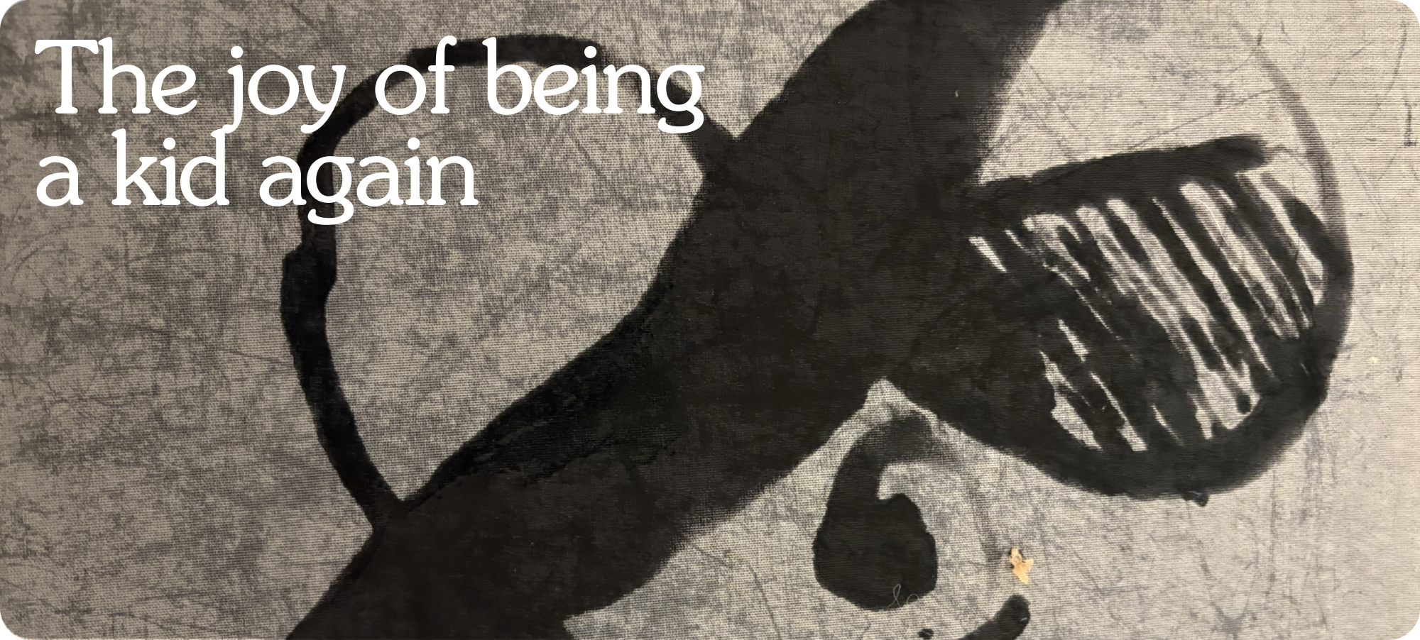
Somewhere between growing up and getting serious, most of us stopped making things just for the joy of making them. We learned to ask permission quietly, in the back of our heads, before we’d even picked up the pen.
What will it look like? What will they think? What if it isn’t any good?
And just like that, the making became about the judgement before it had even begun.
I found my way back to being eight years old last week at the Design Museum. There was an installation, a large pale canvas and a brush loaded with nothing but water. You painted onto the surface and the canvas turned black where it touched. And then, within two minutes, it dried. Whatever you’d made was gone. Quietly, completely, as if it had never existed at all.
And that fact that it all disappeared was the all the permission people needed. Nobody was asking what’s that supposed to be because nothing was there long enough for it to be judged.
You could make anything, badly, joyfully, freely. The canvas would forget. And so, brilliantly, could you. (Unless you took a picture seen above)
That's what being a kid feels like. No audience. No verdict. Just the making. And the good news? You can have it back any time you're willing to pick up the brush.
// Quote of the week //
// The founder diary //
The brief was a leaflet.
The Harley Street Clinic wanted something to promote their paediatric services. A folded piece of paper. A few nice images, some bullet points about what they offered, a phone number at the bottom. Job done.
But before I put pen to paper I did something I always do, I went back in. Slower. Without an agenda. Just walking and looking and refusing to assume I already knew what was there. And what I found in those corridors changed the brief entirely.
They had a children’s hospital. Right there, tucked inside the wider clinic, its own wards, its own consultants, its own world. Nobody had named it. Nobody had given it an identity. It was just quietly existing, waiting for someone to notice what it actually was.
I turned to my business partner and said “Why are we making a leaflet? We should be creating The Harley Street Clinic Children’s Hospital.”
We went back to the CEO, laid out the business case alongside the brand thinking and pitched it properly. He immediately said yes. And just like that, a leaflet became a hospital.
I’ve thought about that moment a lot. About how easily I could have gone back to the studio and started designing something forgettable. About how the whole thing turned on a single question, asked in the right corridor, by someone willing to look at a building like a kid seeing it for the first time, without assuming they already knew what it was.
I went in to design a leaflet. I came out with a hospital.
// The joyful brand – Fats0 Chocolate //
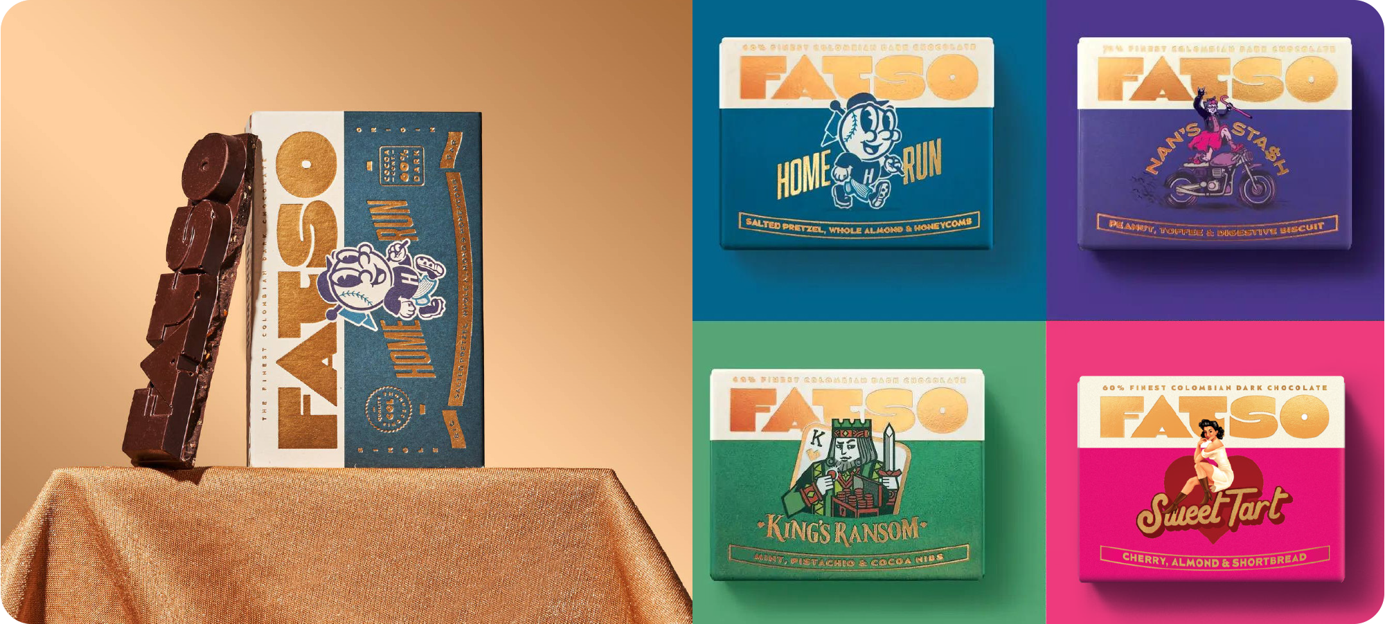
Dark chocolate has always had a reputation problem. Not because it tastes bad but because it insists on behaving as though enjoying it is a serious, considered, slightly superior act. The tasting notes. The percentages. The packaging that whispers rather than speaks. Dark chocolate has decided it is far too refined to really have any fun.
Or rather, they got it, read it and put it straight in the bin.
Everything about Fatso is a cheerful rejection of the category’s self-importance, starting with the name. Fatso. Two syllables that immediately signal that they are not here to be worthy. They are here to be delicious.
The products follow in the same vane. Home Run, Morn’n Glory, King’s Ransom all names that sound like they belong on a race card or a Saturday morning, not on a shelf next to something that describes itself as “single origin, hand-tempered, with notes of dried fig.”
The flavours are just as unapologetic. Salted pretzels and honeycomb, cornflakes and orange marmalade, whole pistachios and a hit of mint. Combinations that make you think obviously, immediately followed by why hasn’t everyone done this.
And underneath all the personality sits something genuinely solid. Ethically sourced chocolate, sustainability-driven production, real care about where things come from and how they’re made.
The best brands always have this quality. Values that run all the way through without ever needing to shout about them.
More Matters, says Fatso. More flavour. More joy. More permission to eat dark chocolate without putting on a performance about it. In a category that’s been taking itself seriously for far too long, they have a simple, inarguable answer for all of it.
Life is too short for boring chocolate.
// New this week – Resolve //
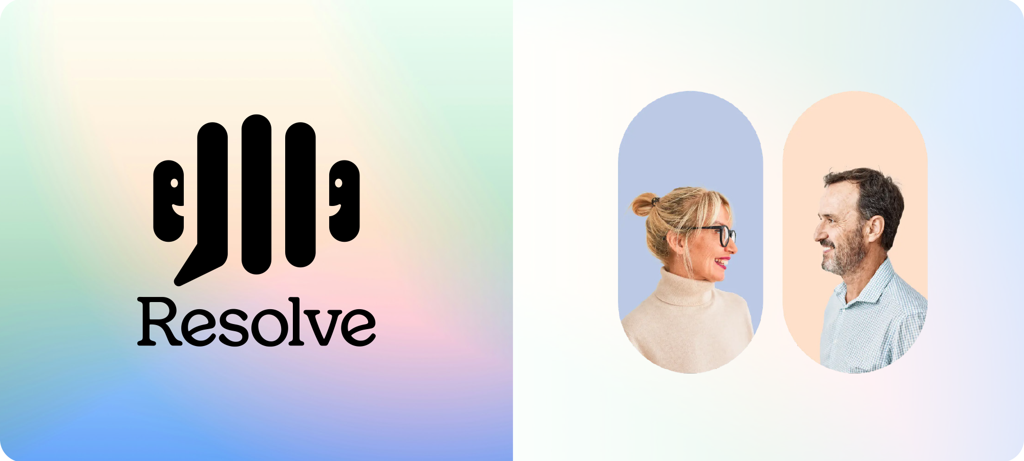
Most healthcare brands look like they were designed for a waiting room. Functional. Forgettable. Built for the system rather than the people inside it.
Resolve had absolutely no interest in any of that.
The logo alone tells the whole story. Look closely and you’ll find three things living inside one mark, A soundwave, a speech bubble and two people facing each other in conversation. Not hidden, not clever for the sake of it, but genuinely earning its complexity because every layer means something.
This is a brand about listening, about talking, about two people navigating something difficult side by side. The icon just says all of that without a single word.
Then there’s the colour palette soft, luminous gradients in periwinkle blue, mint, blush pink and warm peach that feel less like a healthcare brand and more like a hopeful morning. VC Henrietta, the typeface, brings warmth and character that a sans-serif could never quite manage here.
Better Outcomes Through Better Conversations. In a sector drowning in data and clinical language, this brand lands like a warm hand on a cold day.
Joyful doesn’t always mean loud. Sometimes it means kind, considered and quietly full of hope.
This is what that looks like.
// Word of the week – Stratejoy™ //
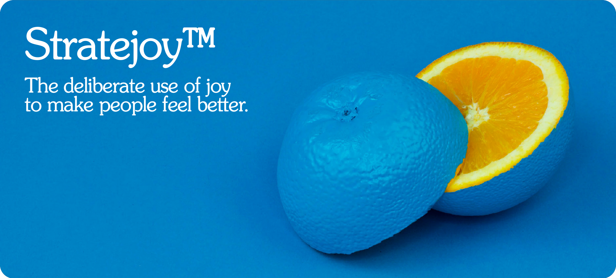
Most of us treat joy the way most businesses treat feeling, as something that happens once the serious work is done. Finish the project, then enjoy it. Hit the target, then celebrate. Build the brand, then worry about whether anyone actually likes it. Joy gets bolted on at the end, if it gets included at all.
But what if joy wasn’t the destination? What if it was the blueprint?
Stratejoy™ is an intentional plan for how every touchpoint, every interaction, every moment of contact is going to make someone feel. Not by accident. Not as an afterthought. On purpose, from the start, designed in rather than hoped for.
Because the truth is, people don’t choose rationally. They choose emotionally and justify it rationally afterwards. The businesses and brands that have deliberately designed how they feel will win over the ones that haven’t, almost every single time.
Not because they’re better. Because they feel better.
Stratejoy™ works the same way in life. The people who seem to live most joyfully aren’t the ones who’ve earned it. They’re the ones who designed for it — who made small, deliberate choices about how they spend their time, who they give their energy to, and what they refuse to tolerate. They stopped striving to be joyful and started living like joy was already the plan.
Stratejoy™ isn’t soft. It is the strategy. The question worth asking every single day, not just what am I doing, but how does it feel while I do it?
I recorded a webinar on this a week or so ago. Click the link below if you would like to see the recording.
Watch my webinar on stratejoy™
// Who or what is Wonderment? //
Wonderment is the joyful branding agency. We make businesses more effective by making their branding more affective. Wonderment isn’t just a name. It’s something wonderful, done on purpose. Something meant. Got something exciting brewing, drop me and email let’s chat.


Subscribe to Wonderfuel
Your fortnightly spark of Strategic Joy™, landing in your inbox every Moanday morning. Because joy isn't a reward for getting through the week it's what gets you through it. No hacks. No homework. Just one idea engineered to mess with the gloom.