Wonderfuel Issue Number 11 – The joy of creating words
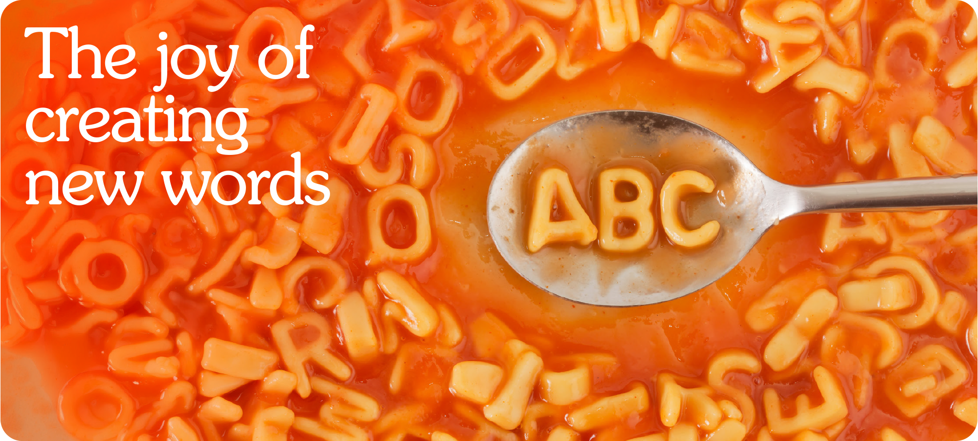
Have you ever created a word?
I’m sure you probably have, but not since you were a kid.
My first was bubby. The name I gave to my security blanket when I was about three.
The next one took a little longer but it arrived with a bang. During Covid I was out on one of my Instagram “Big Man Walks and Talks” when the word weaknecessary popped into my head. The idea that sometimes we need to see our weaknesses clearly before we can grow.
A few years later when I had just started Wonderment and joy was firmly at the helm, another word appeared. Wondermental. An adjective used to describe when something is more than good. When it is delightfully purposefully jaw droppingly magical. Exactly the kind of work I want to create.
Then they just kept coming.
Wonder(mo)ments.
Enjoyneering.
Joyney.
And most recently Edjoycation. The idea of putting joy into education brands so they feel more human.
Which proves something rather lovely.
If you spend enough time thinking about joy
eventually the dictionary starts making room for it.
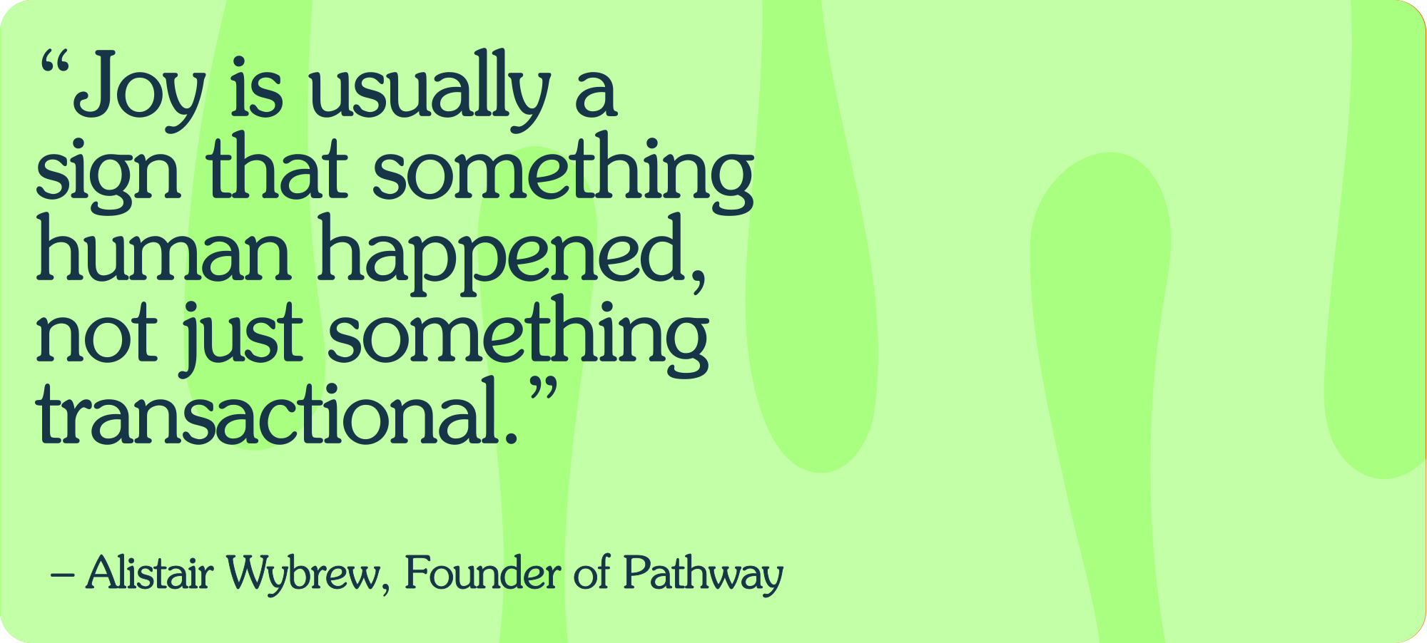
// Quote of the week //
// The founder diary //
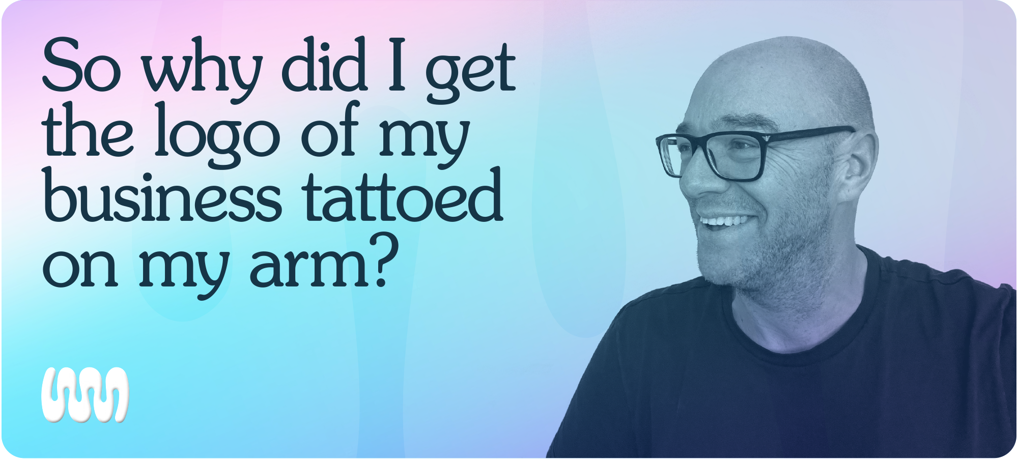
Firstly it’s had nothing to do with me recently bingeing Yellowstone.
I waited a decade to get a tattoo.
Not because I didn’t want one. But because I’m a creative. And creatives have a terrible habit of looking back at things we’ve made and thinking “I’d do that differently now.”
Logos change. Styles evolve. Tastes wander.
Tattoos, not so much.
Then something clicked.
Wonderment was never just a logo. Never just a name. Never just pink and blue wobbly letterforms.
It stood for something joyful. Something wonderful. Something done on purpose.
Joy. On purpose.
And more importantly, my joy.
After years of it being buried under life, work, noise and nonsense, Wonderment was born from rediscovering something I used to have effortlessly as a kid:
A natural instinct for joy and a slightly mischievous desire to bring that feeling to others.
So this isn’t a tattoo of a logo. It’s a tattoo of what I stand for.
Because whatever happens to me, whatever happens to wonderment, whatever reinventions, pivots or plot twists show up along the way
Joy isn’t part of who I am.
It’s the entire thing.
Have I essentially branded myself like our ancestors branded their cattle?
Yes.
And I’m oddly comfortable with that, after all I am in the business of branding.
And because in a world of carefully curated sameness, joy is my mark of distinction.
// The joyful brand – Penguin Random House //
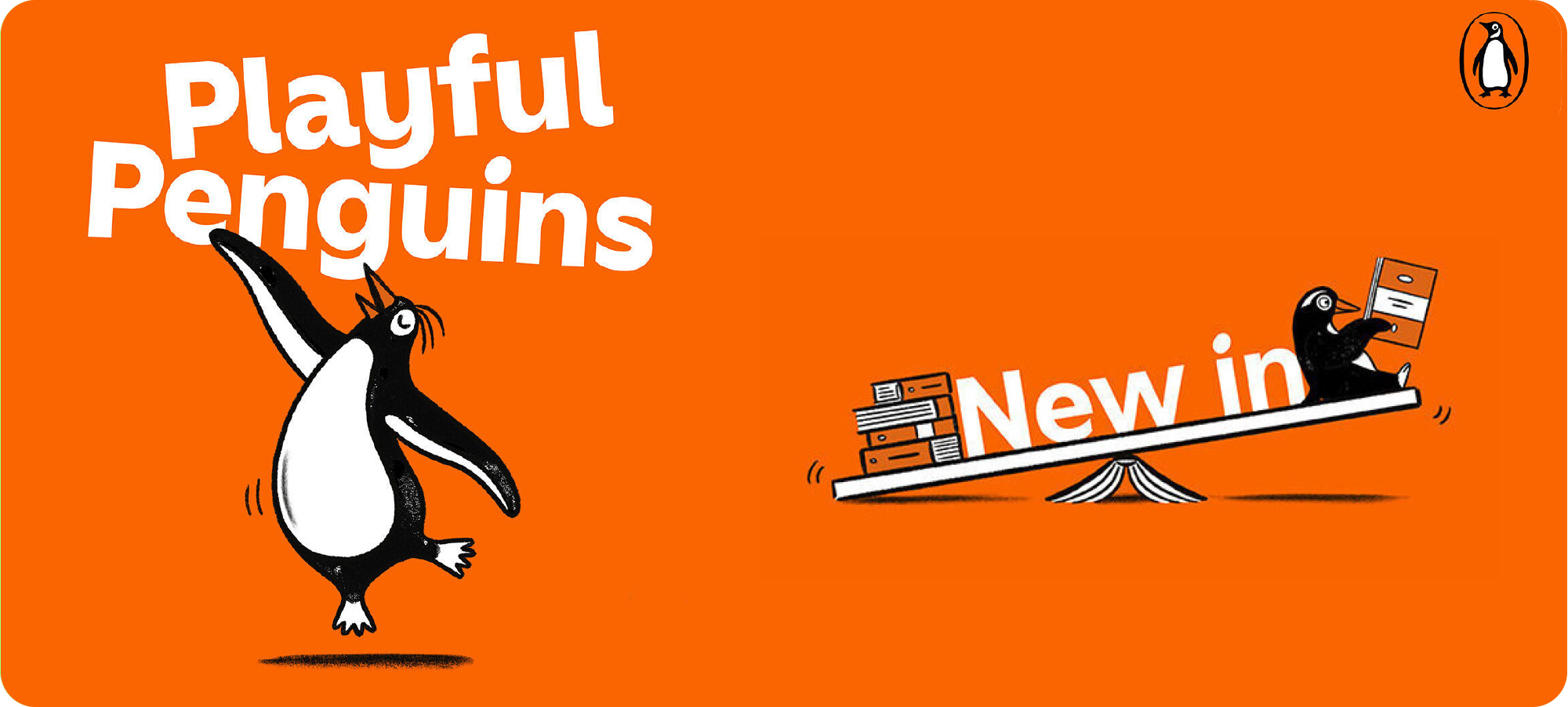
One of my favourite branding systems ever is the Penguin book cover system designed by Jan Tschichold in 1946. With typographer Tschichold at the helm typography was not an accessory to the Penguin brand. It was the brand.
In 2003 Pentagram’s Angus Hyland was asked to evolve the trademark for its 50th anniversary. It became a classic exercise in how to evolve a recognised mark with huge brand equity while protecting the characteristics that give it its distinctive identity.
And now to today.
Meet the Playful Penguins. A new suite of illustrations that forms part of Penguin Random House UK’s recent visual identity refresh.
The penguins now appear across a wide range of applications from seasonal campaigns to social impact initiatives so they need to be flexible and adaptable.
Rather than fixed scenes they form a joyful library of poses and props that can be mixed and matched to support different messages.
Jumping. Strutting. Dancing. And of course reading.
Lots of reading.
// From the archives – Deloitte //
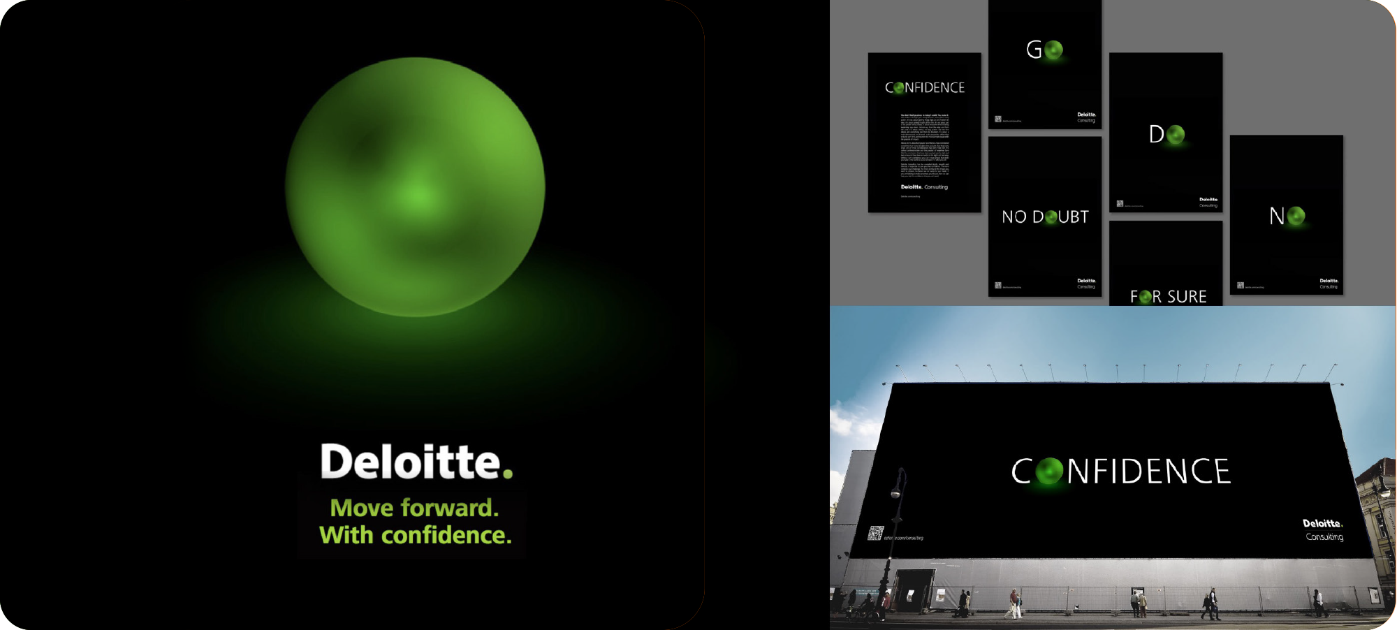
This week’s archive takes us back 13 years to my time contracting with the world renowned agency The Partners now Design Bridge and Partners.
The Green Dot has been Deloitte’s iconic brand mark since 2003. A simple device that represents unity connectivity and a 360 degree approach to solving client challenges across audit tax consulting and advisory.
The question was how could the green dot better reflect the confidence Deloitte brings to its audience.
The answer was simple. Bring the dot to life and make it real.
The best way to communicate confidence is to be confident.
In this campaign for Deloitte Consulting the green dot was finally allowed to step forward and do the talking. A single mark used with intent paired with bold doing words like Go Now No and For Sure.
Given purpose. Given presence.
A symbol designed to move forward with confidence.
// Who or what is Wonderment? //
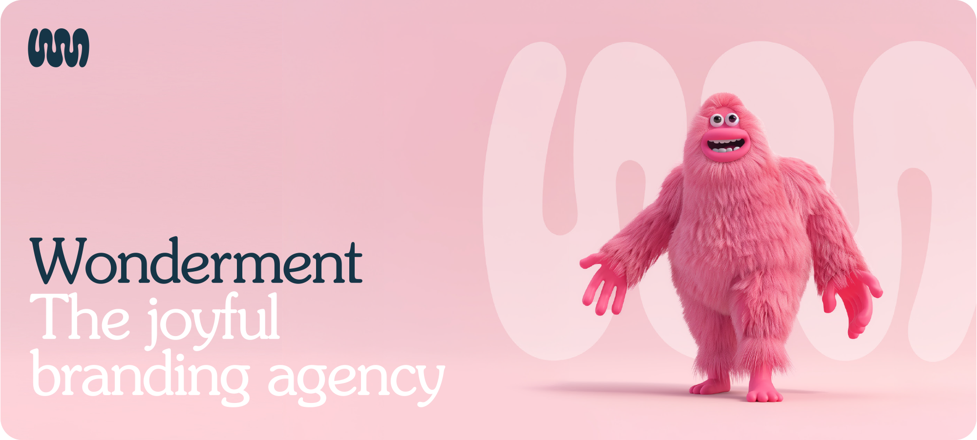
Wonderment is the joyful branding agency. We make businesses more effective by making their branding more affective. Wonderment isn’t just a name. It’s something wonderful, done on purpose. Something meant.
Got something exciting brewing, drop me and email let’s chat.


Subscribe to Wonderfuel
Your fortnightly spark of Strategic Joy™, landing in your inbox every Moanday morning. Because joy isn't a reward for getting through the week it's what gets you through it. No hacks. No homework. Just one idea engineered to mess with the gloom.