Wonderfuel Issue Number 10 – Joy is designable

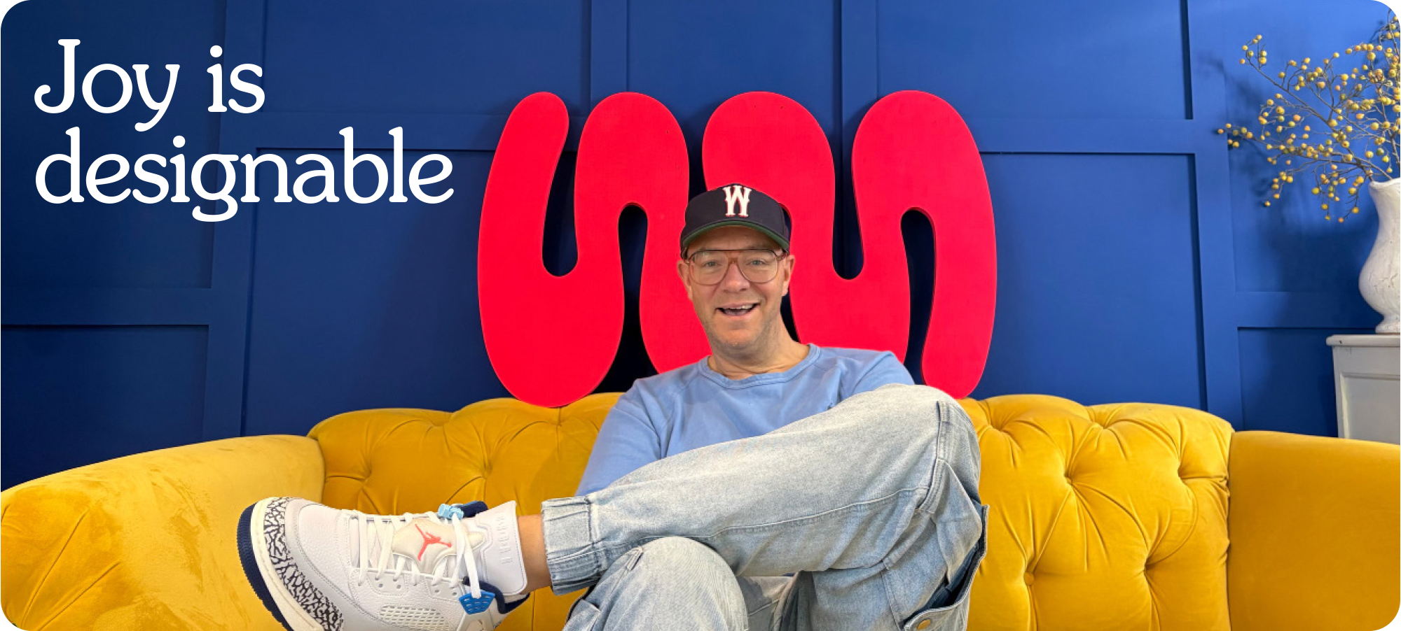
There’s a house we can build
Every room inside is filled
With things from far away
The special things I compile
Each one there to make you smile
On a rainy day.
A million dreams from The greatest Showman.
There is a quiet assumption that joy is accidental. That it appears when timing improves and pressure eases and the rain stops and until then we get on with being serious.
But what if joy is not accidental at all? What if you could design and build joy?
Well, you can of course.
We design homes with intention. We choose the light the colour the objects the atmosphere we want a room to hold. Yet when it comes to joy we behave like tenants waiting for it to arrive rather than designers capable of building it in.
Brands are environments and environments shape emotion long before logic gets involved. Before someone reads your strategy or weighs up your credentials they feel something. Safe or uncertain. Energised or flat. Welcomed or processed.
If a brand feels cold or forgettable that was not fate. It was design. Neutral is designed. Invisible is designed. Which means joy can be designed too not as decoration but as emotional clarity that makes someone think this feels right.
Joy lives in clear language instead of jargon. In warmth instead of performance. In thoughtful details that reduce friction and increase humanity. You cannot spreadsheet emotion but you can design for it.
Joy is not soft. It is strategic. And most importantly it is designable.
// Quote of the week //

// The founder diary //

This week I have been invited to run a workshop at UbiqX Live at Tobacco Dock. If you had told me a few years ago that I would be standing in a room full of education leaders talking about joy I probably would have laughed.
Why did they choose me?
Pure and simple. Joy.
Maddie Lindgard from Ubiq X Live who is running the event messaged me after seeing me champion joy again and again and asked a beautifully direct question. Do you work with education brands and could you run a workshop that weaves joy into it?
Well obviously.
The title is exactly what you would expect.
Edjoycation - Putting joy into education brands.
In an increasingly noisy pressured and uncertain world education brands are being asked to do far more than inform. They are being asked to reassure. Families learners and partners are navigating a landscape that feels complex and unpredictable and in moments like that the brands people choose are rarely the loudest or the most polished. They are the ones that feel clear human and emotionally safe.
That is where joy comes in.
Not as something fluffy or superficial but as a strategic tool. A way of helping brands feel calmer more confident and more memorable. A way of creating emotional clarity when everything else feels overwhelming.
In this session I will be reframing joy not as decoration but as direction.
What will attendees get. A whole lot of joy and a bucket load of insight into why it works commercially. Absolutely zero beige thinking. High energy. Clear thinking.
Proper Wonderment.
// The joyful brand – Surreal Cereal //
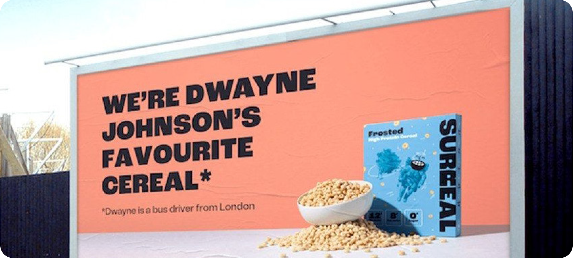
Surreal is joyful not because it tries to be cute but because it understands that breakfast is boring and decides to misbehave anyway.
The cereal aisle is a sea of worthy promises and nostalgic mascots all shouting about fibre childhood and family mornings. Surreal walks in looks at the category codes and calmly sets them on fire. High protein. No sugar. Ridiculous claims delivered with a straight face. Packaging that feels more streetwear than supermarket. It breaks the rules in a way that feels intentional rather than chaotic.
That is where the joy lives.
Joy in branding is rarely about rainbows. It is about contrast. Surreal creates emotional lift by behaving differently to everything around it. The tone is dry self aware and slightly absurd. The visual identity is bold and confident. The product benefit is serious but the delivery refuses to be.
That tension creates delight.
You smile because it does not sound like a cereal brand. You trust it because beneath the humour the proposition is clear. You remember it because it does not blend in. That is strategic joy at work. Not decoration. Differentiation.
Surreal proves that joy is designable. It is crafted through tone language visual confidence and a willingness to disrupt category expectations. In a world of beige breakfast brands it chose to be brilliantly weird.
And brilliantly weird done with purpose is often where the joy begins.
// From the archives – BrandStrand by BeColourful //
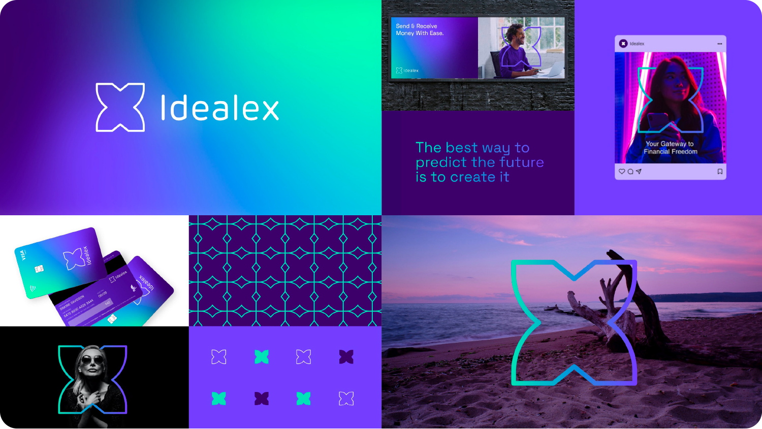
Every now and then I look back at a project and smile not because of how it looked but because of what it stood for.
Idealex was a new challenger banking app entering the market as crypto shifted from curiosity to credibility. It enabled customers to send and receive funds in both crypto and fiat currencies which meant it was not just another app. It was a bridge between two financial worlds.
The strategic territory was clear from the start. Freedom.
Financial freedom. Control. Mobility. The ability to move your money without friction or permission. In a category crowded with cold tech language and transactional aesthetics we anchored the brand around something far more human. The idea that your money should move as freely as you do.
The identity centred on the X in Idealex. The X became more than a letter. It became a symbol. Historically the X form has appeared as a mark of resistance and freedom most notably within the Civil Rights movement in the United States where it signified autonomy and self determination. That cultural weight gave the brand depth beyond fintech styling.
We refined the X into a sharp modern mark that felt precise and progressive aligned with the cutting edge nature of the crypto industry while still carrying symbolic substance. The result was a logo that felt bold and directional less about decoration and more about declaration.
Looking back what I love most is the clarity. A simple idea. A powerful symbol. A modern execution.
Freedom designed on purpose.
// Who or what is Wonderment? //
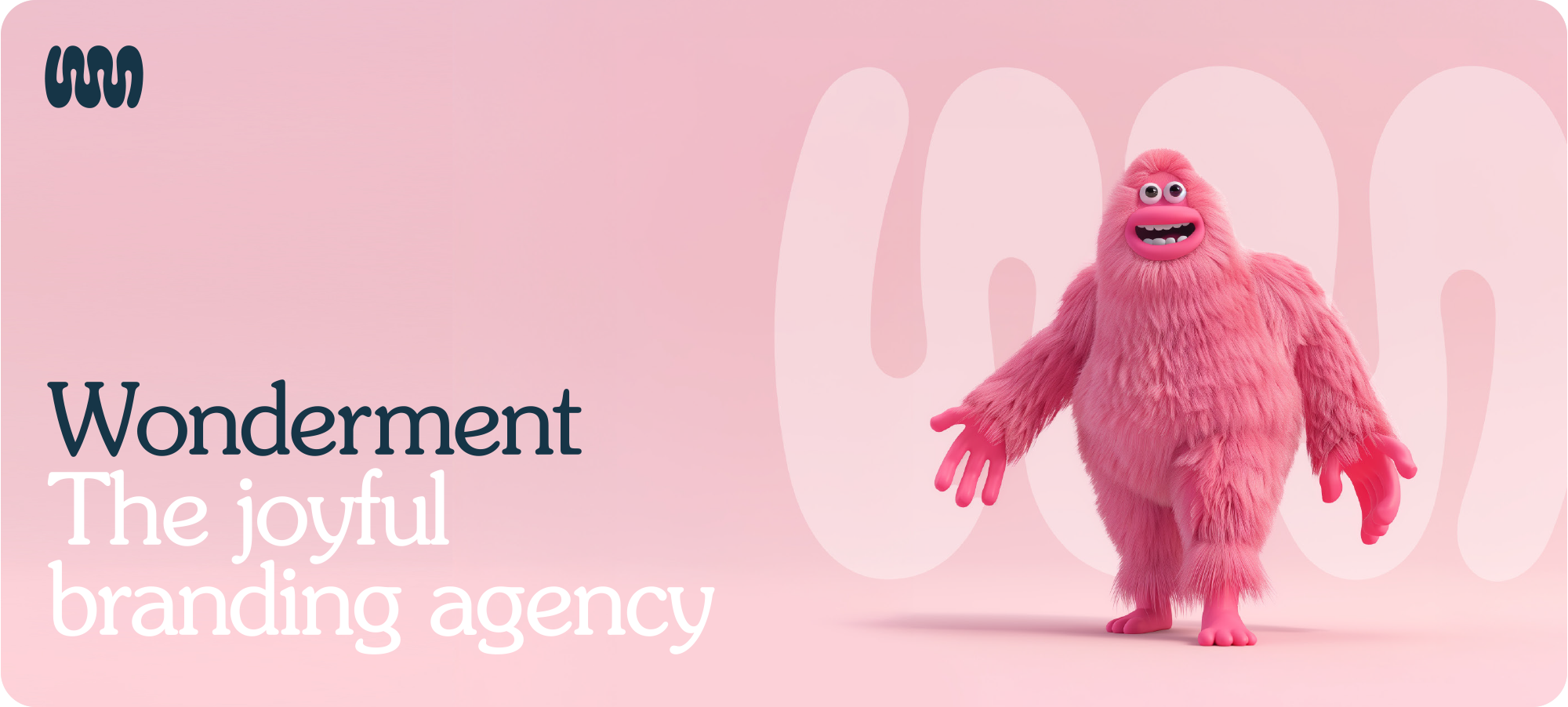
Wonderment is the joyful branding agency. We make businesses more effective by making their branding more affective. Wonderment isn’t just a name. It’s something wonderful, done on purpose. Something meant.
Got something exciting brewing, drop me and email let’s chat.


Subscribe to Wonderfuel
Your fortnightly spark of Strategic Joy™, landing in your inbox every Moanday morning. Because joy isn't a reward for getting through the week it's what gets you through it. No hacks. No homework. Just one idea engineered to mess with the gloom.